Read The
Current Issue
Log Time
Although no longer the dominant force it once was in the Jackson Hole materials palette, there’s still something special about living with log, especially when combined with open, light-filled spaces.
// By maggie theodora
In March 2021, work started on a 5,000-square-foot log house in Crescent H Ranch. Built in the mid-1990s, when everyone wanted a log cabin in Jackson Hole, the house was being remodeled and added on to by its new owners, who worked with Baxter Design Studio. “There is a real warmth to log and a feeling of the Old West, but the house didn’t work for us,” the homeowners say. “We approached Chris [Baxter, principal at BDS] with the idea to really make this thing all it could be and create a ‘wow’ factor.” The house is now finished, and it has a definite “wow” factor…so much so that Baxter says he’s heard from several other area homeowners. “They had no idea that something like this was possible with a log house, and they want something similar done to their homes, which were built in the same era.” Baxter is candid with these potential clients. “Remodeling a log home is not more work than a new build, but it is not simple,” he says.
For property owners with the potential to do a new build, log as used today is very different than it was used a couple of decades ago. “Some of the most interesting design happens when traditional and modern materials and methods are mixed,” says Tom Ward, principal and partner at Ward | Blake Architects. For inspiration, here’s a look at the finished BDS project, a Ward-designed new build, and a 1960s log cabin reimagined and renovated by WRJ Design that Architectural Digest proclaimed to be the “perfectly updated log cabin.”
Teton Village New Build
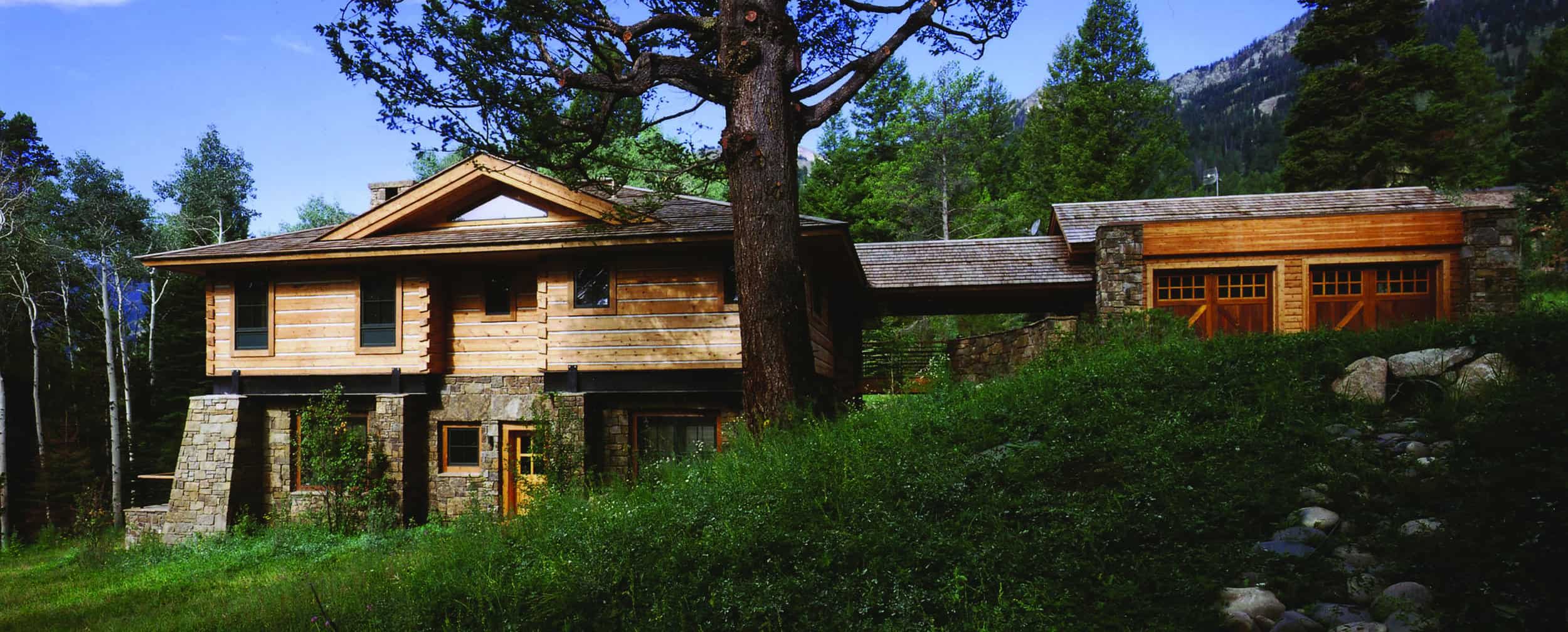
An existing client came to Tom Ward, a principal and partner at Jackson-based Ward | Blake Architects, to design a new-build log home in Teton Village. Even though Ward has been designing homes in Jackson Hole since the late 1980s—when traditional log homes were popular—he says he has done only a few log homes. “It is not our usual or standard approach,” he says. Still, he took on this project. The client knew he wanted the home to use rectangular hand-hewn logs. “He loved the material,” Ward says. “It really spoke to him and is an interesting material to me because it really has a presence. Each individual timber is massive and generally gives you a sense of solidity; these timbers were worked by traditional tools and by hand. From a materiality perspective, [rectangular logs] have more of this sense of solidity than a round log.”
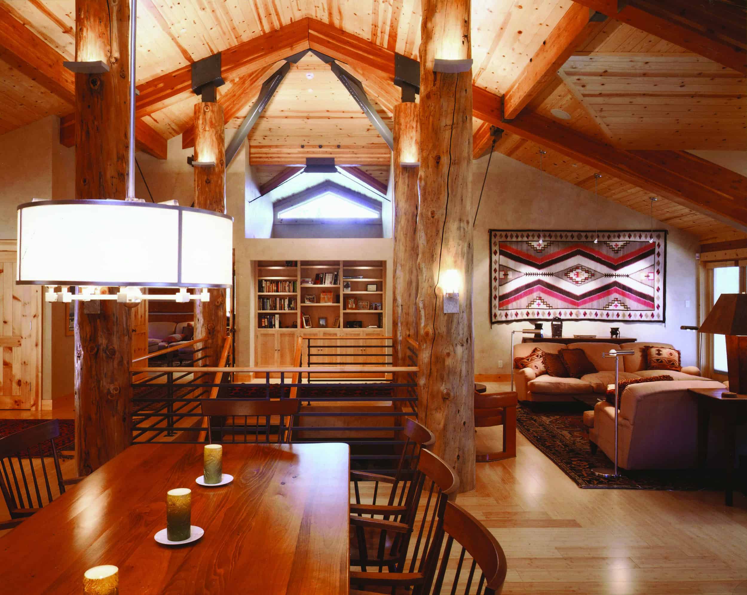
Part of the client’s program was a large public area. “He didn’t want a series of rooms,” Ward says. “I saw this space and its roof spanning the house from one side to the other.” Such a roof, on a home in Teton Village, would have to support a substantial snow load, though. To create the necessary structural support with logs, “you start stacking giant wood beams on top of giant wood beams, which is visually very heavy,” Ward says. “I wanted to do something that wasn’t visually heavy. Steel was an automatic thought. Steel trusses can be smaller and, scale-wise, look light.”
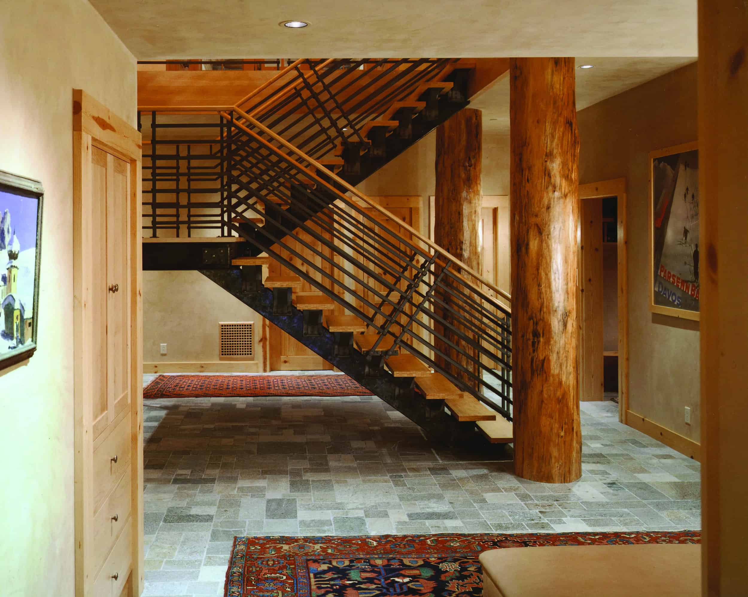
“Each of the materials selections has to reinforce modernism juxtaposed over tradition,” Ward says. The stairway is all done in stainless steel, a modern material, but “it is clean and simple and absolutely minimal in execution.” Also, every surface of this steel was run through a forge and hand-hammered. The end result is “not unlike the hand-hewn log surface,” Ward says. Blacksmith Steve Fontanini used traditional techniques to “take the machine qualities away from the stainless. The stairs are assembled and riveted together in the most traditional sense. There was no welding or grinding,” Ward says.
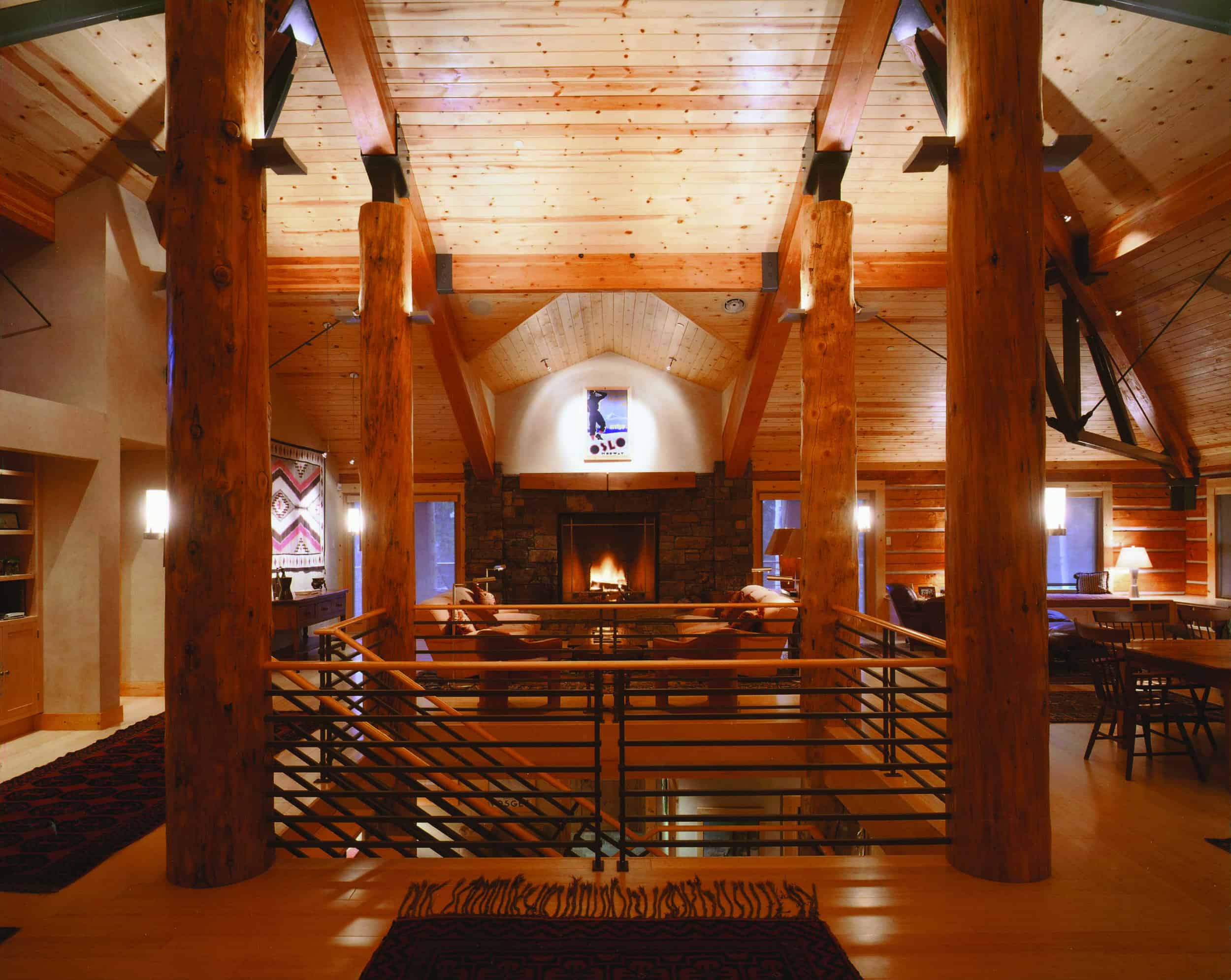
While Ward wanted an open, vaulted ceiling, he went with log for the four corners of the grand staircase. Here, “steel wouldn’t have had the presence of log,” he says. So they used four old-growth Douglas fir logs (inside of which, for structural purposes, there is steel) to anchor the stairs, and topped each with steel that connects to timbers in the ceiling. “I wanted to juxtapose something modern and light—the steel—on top of a traditional log,” he says. Ward admits about the design, “It was a hard sell to the client. I talked about modern treatments of traditional materials and traditional treatments of a modern material. But [this client] is always up for something interesting and told us to go for it.”
Crescent H Remodel
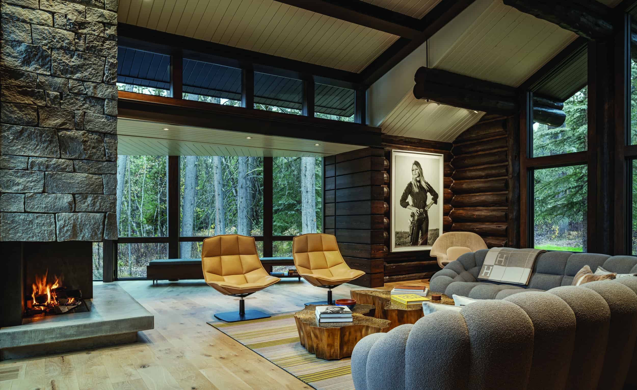
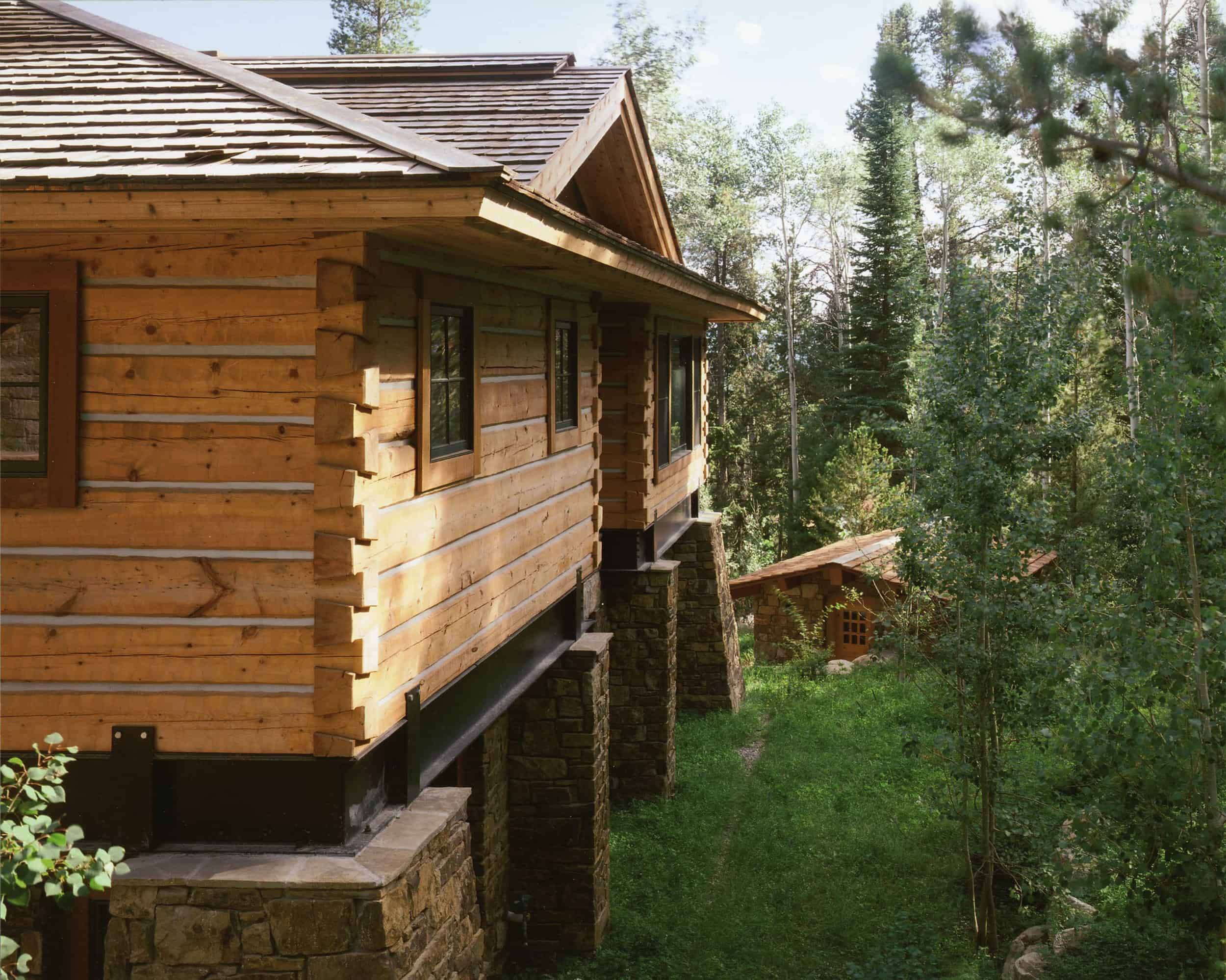
Architect Chris Baxter, founder and principal of Baxter Design Studio, attributes much of the success of this project to the homeowners. “They were willing to take chances and make some big moves,” he says. The original home was compartmentalized; in the remodel, walls were removed, windows added, and rooms moved around. The home’s main public spaces—a den, dining room, and kitchen—are now open to each other, and to the outside. Clerestory windows (shown here) were included in the addition to the living area. “A beauty of a log structure is that it is built from materials that appear to come from the site, so it is integrated into the site. But, when you’re inside a traditional log cabin, you don’t feel like you’re on the site. By adding windows and light, you really experience the site.”
The homeowners say, “It doesn’t have to be rustic or modern. It can be both.” To the right of the photograph in the corner are the old logs; on the other side are new logs at the beginning of the addition. “It’s like old Jackson meets new Jackson, right here in this one spot. We took a step into the future with this [project], but brought along the wonderful elements of its past,” the homeowners say. “It would maybe have been more cost effective to not keep anything, but then we wouldn’t have ended up with what we did, which is something unique.”
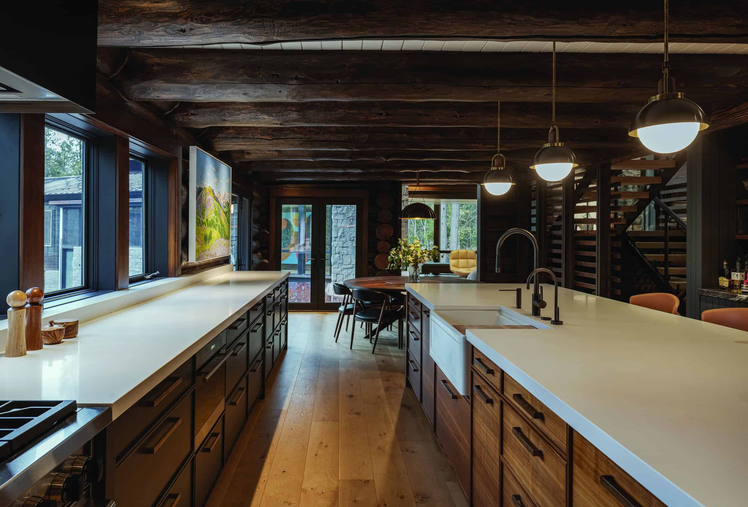
Baxter says the old kitchen was dark and “uncomfortable to be in.” His design for the remodel included removing walls to connect what had formerly been separate spaces and bring in light. “We did this, and, all of a sudden from the kitchen, you can see into the rest of the house. The family spends so much time in the kitchen now,” he says.
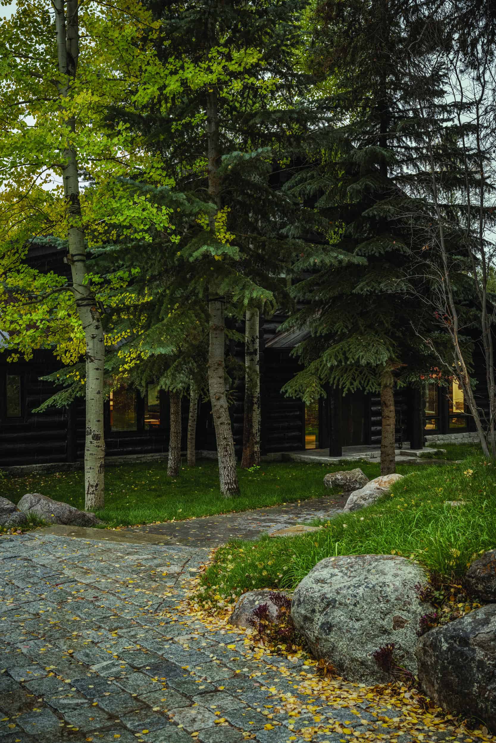
The owners of this Crescent H home say, “We fell in love with Crescent H more than this particular house. It is such a special community. There was only one house available, and we saw that it had potential for transformation.” In late 2020, the family bought a 5,000-square-foot log home, built in the mid-1990s. Work remodeling it and adding about 2,500 square feet of additional space started the following March. The family moved into the remodeled area of the home last January; the final details of the addition were finished this fall. “It is a total and complete transformation. We still have the warmth and coziness of log and now an added openness and airiness that is this unbelievable juxtaposition,” the homeowners say. It wasn’t just the interiors that were transformed. The exterior of the home—both the original structure and the addition—were stained dark for a more modern look.
Spring Creek Remodel
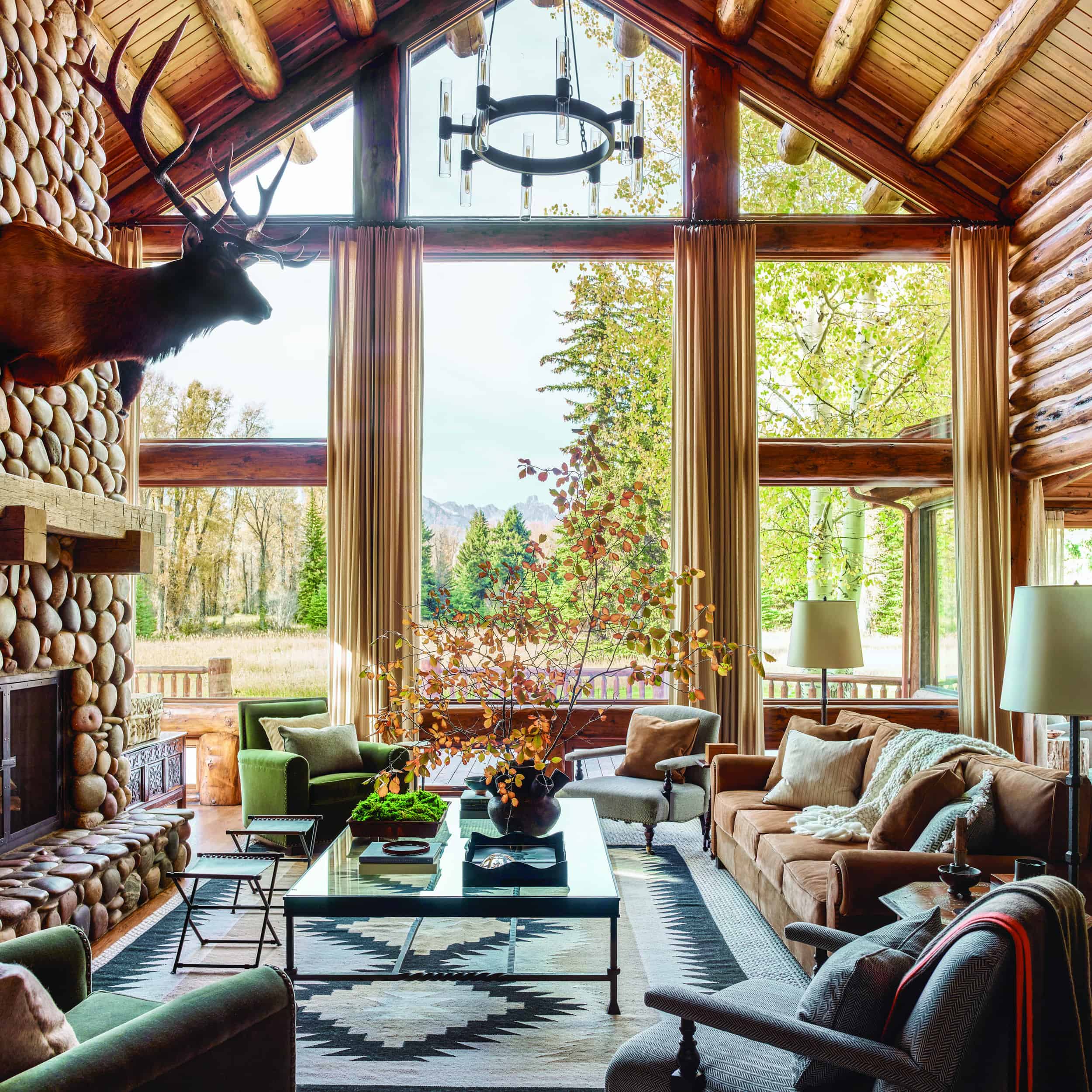
The new owners of a log cabin dating from the 1960s wanted to honor the home’s past and authenticity, but do so in a modern way. They worked with Berlin Architects and WRJ Design, and the finished project was featured in Architectural Digest in July 2021. This river rock fireplace was part of the original home, and the rocks in it came from the Snake River and its tributaries. “This rock can really be a nice, natural element in a home,” says Rush Jenkins, creative director and co-owner of WRJ Design (with his partner and COO Klaus Baer). “But, like many fireplaces of that era, it had a heavy mantle of knotty, knobby wood. We updated the mantle to be reclaimed timber, which is lighter and has a simplicity to it that can be more contemporary in the Western vernacular.” A center post was also removed in this room, and more and larger windows installed. “There are ways of engineering things now that weren’t possible when these houses were built,” Jenkins says.
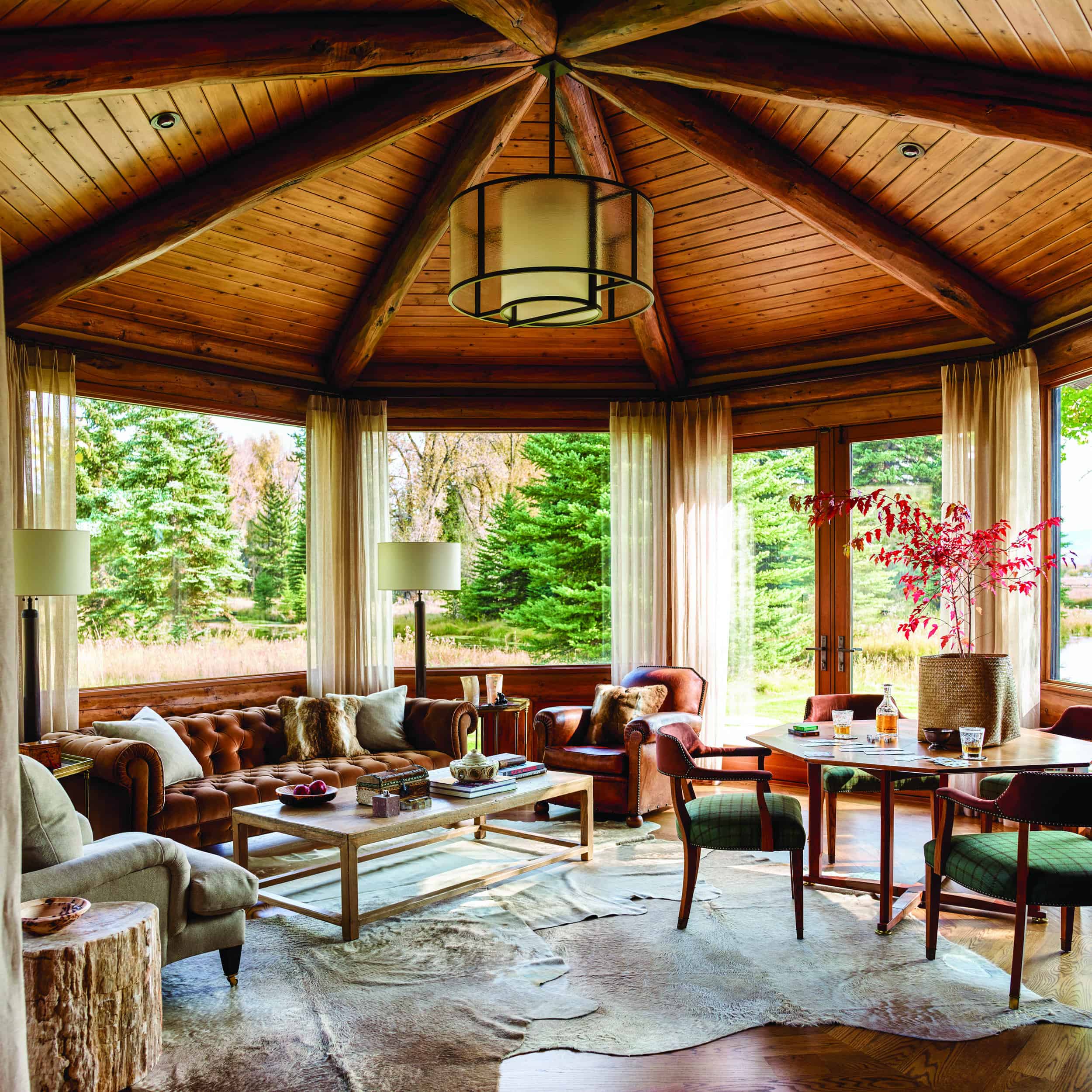
“The cowhides layered on the floor bring rusticity in a contemporary way,” says Jenkins about the den/game room. A Chesterfield sofa, which has very traditional lines, was done here in a suede and accented with fur pillows. The game table is antique, and the chairs surrounding it are done in a combination of suede and plaid. The coffee table is rustic but has contemporary lines. WRJ kept the drapes simple; they’re a sheer linen. “Furniture and fabric selections are a great way to mix traditional and contemporary,” Jenkins says.
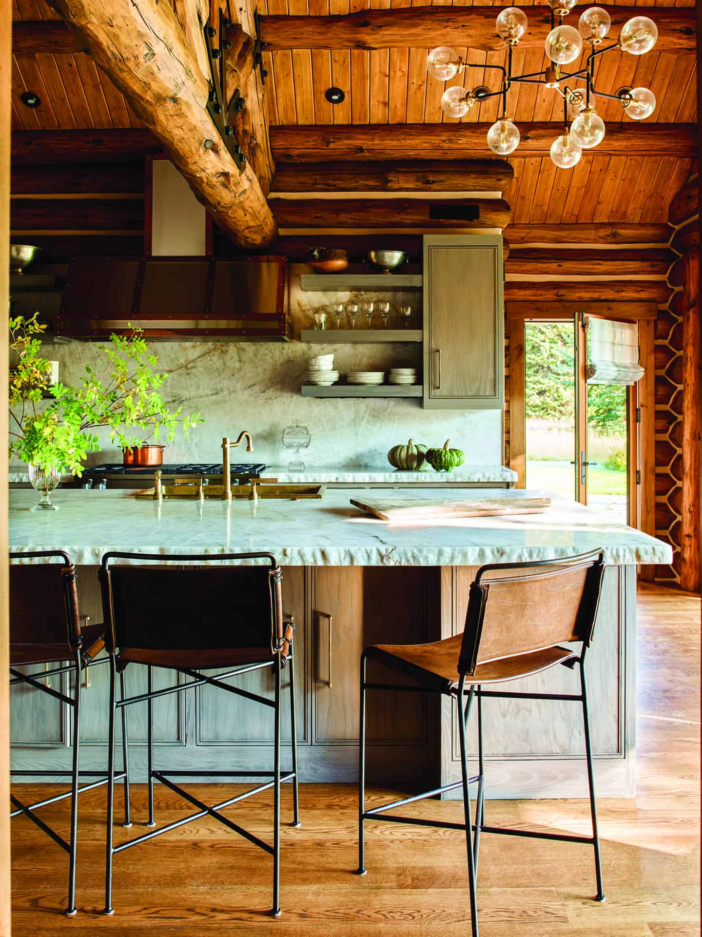
Originally, the logs in this house were “quite yellow,” says Jenkins. “We glazed them to more of a walnut color, which warmed it up a lot and certainly brings the home to the current aesthetic.”
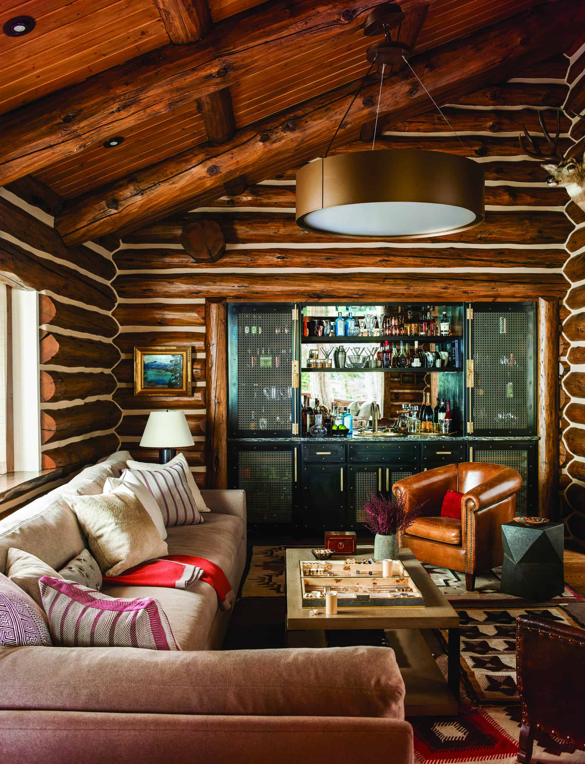
“The client wanted to do something here that was unique and that hadn’t been done before,” Jenkins says. “She wanted it to feel fresh and new, but also with a nod to the rustic.” To do this, WRJ combined steel with gold finishes, including rivets, on the sink, faucet, and handles of the bar. The backsplash is an antiqued mirror, and the bar countertop is a leathered granite. Jenkins says the end result “is very rustic, but has sophisticated elements and some surprises.”
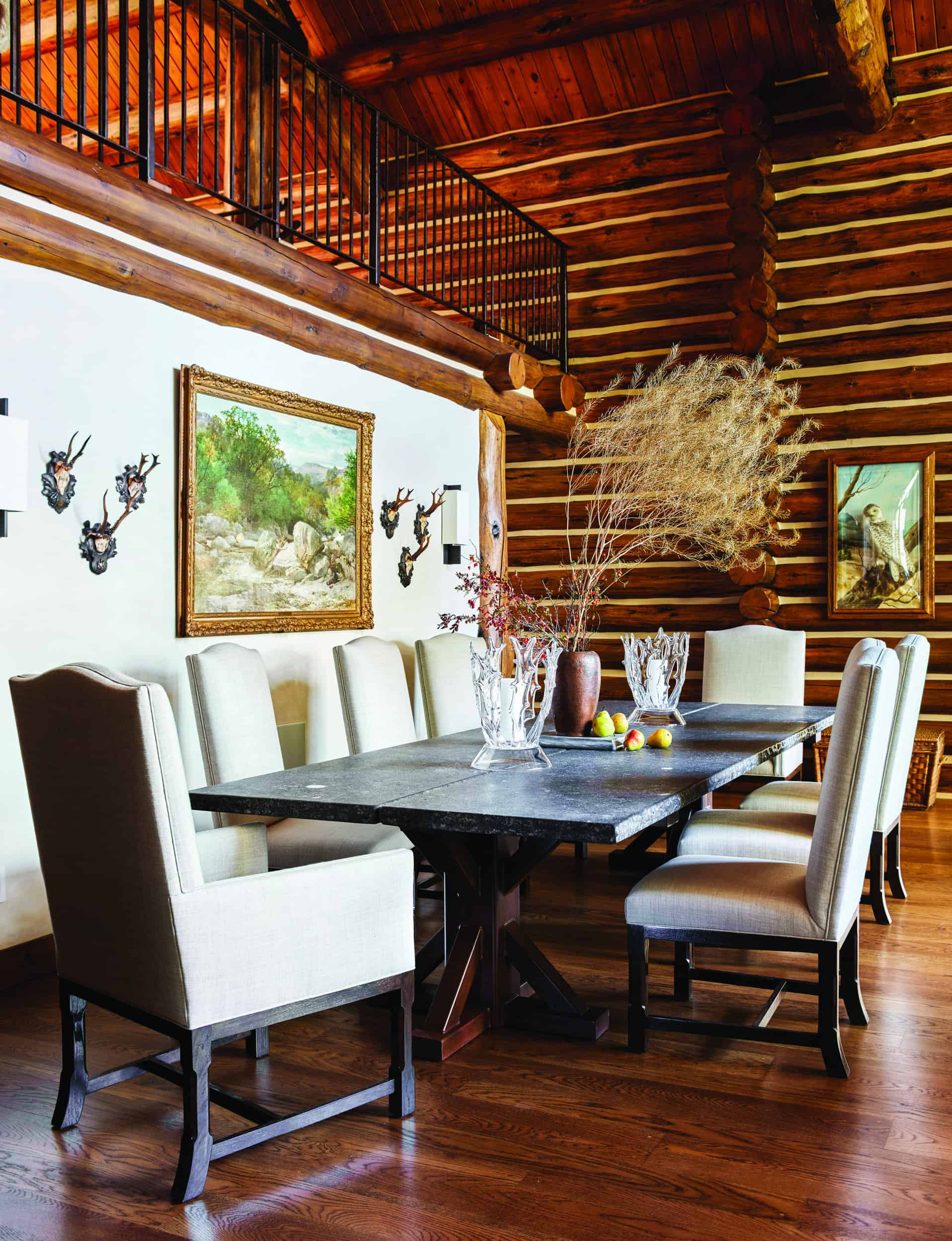
Formerly this wall was about half the height it is now, and the stair railing was made of log. Replacing the log railing with an iron one “brings a lighter touch,” Jenkins says. To brighten the space further, the new wall, like many others in the home, was finished in plaster. “Plaster makes it much brighter, and here it serves as a backdrop for this painting, two beautiful sconces, and some mounts,” Jenkins says. JH

